
Project 2026
Gymgrossisten
Redesigning the shopping experience to
improve product discovery and conversion.
View prototype ->
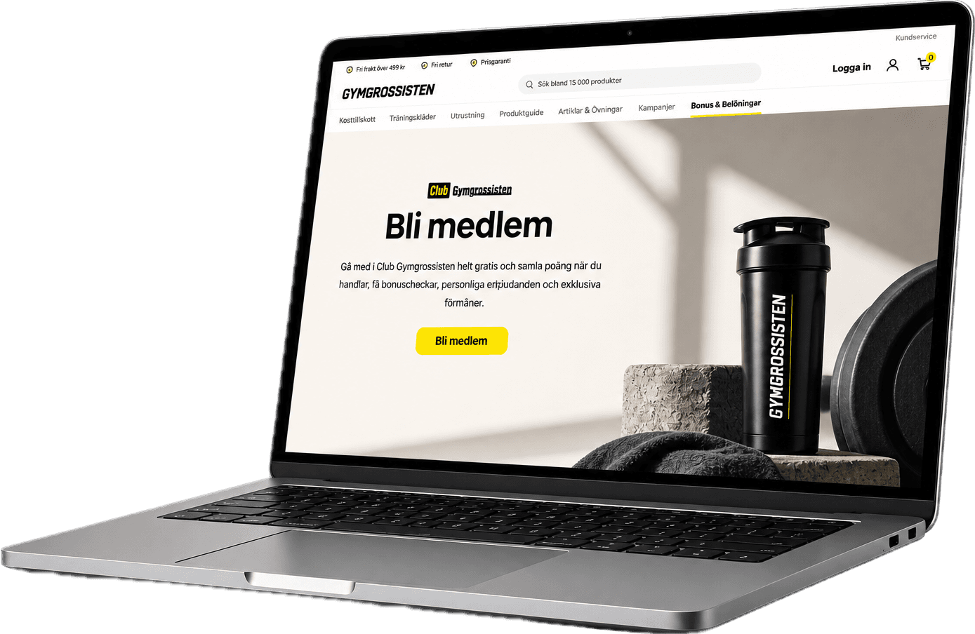

I redesigned Gymgrossisten’s e-commerce experience using quantitative data from GA4 and qualitative data from Symplify to identify usability issues and user needs. The project focused on improving the shopping experience, the product discovery and the Club Gymgrossisten experience by simplifying information, strengthening visual hierarchy and creating clearer user journeys. I redesigned key pages, membership levels, the navbar, rewards and product components, supported by research, analysis, prototyping and a reusable design system in Figma.
Summary


UX/UI Designer, Data Analyst
Figma, Lovable, GA4, Symplify
Data-driven UX redesign
Web & shop experience
6 weeks


Overview
Role
Tools
Timeline
Scope


Research
Define
Ideate
Design
Validate





GA4 and Symplify analysis,
user behaviour and
heuristic evaluation
Identified pain points,
opportunities and key
user needs
Explored solutions through
sketches, wireframes
and UX concepts
Created high-fidelity UI,
prototypes and a
reusable design system
Created high-fidelity UI,
prototypes and a
reusable design system
An overview of my design process and the key steps that I took.
The Process
See the final prototype here ->
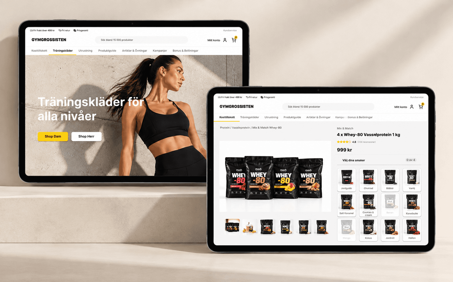
The redesigned experience focuses on clarity, hierarchy, and easier decision-making across key pages.
Clearer membership experience and value.
Faster access to points and rewards.
Simpler product discovery and a better shopping experience
Reduced cognitive load
Overall, the redesign reduces friction, improves clarity, and creates a more intuitive path from exploration to action.
The Solution


Users were met with a lot of information
at once, increasing cognitive load
Too much information
The benefits of Club Gymgrossisten and the
different membership levels were not immediately clear
Unclear value
The experience could better guide users, show progression
and motivate them to engage with the membership program
Missed opportunity
Gymgrossisten’s existing experience contained valuable information about products, membership benefits and rewards, but the information
was not always easy to understand or navigate. The main challenge was to reduce cognitive load and make the experience feel simpler and
more intuitive. Users had to process a lot of information at once, making it harder to understand the value of Club Gymgrossisten, how the
different membership levels worked, and what benefits they could unlock. There was an opportunity to create a clearer experience that would
help users quickly understand the benefits, see their progression and feel motivated to engage with the membership program, while also making product discovery more seamless.
The Challenge